
Self Compare App Concept - Case Study
This case study looks at body dysmorphia through the lens of a gym-goer. I created a mobile app that flips comparison on itself to radically reframe the fitness journey.
By removing external metrics and focusing comparison solely on one's past physical self, the app reinforces self-trust and reduces the psychological toll of unrealistic digital standards.
By removing external metrics and focusing comparison solely on one's past physical self, the app reinforces self-trust and reduces the psychological toll of unrealistic digital standards.
The problem: As an avid gym goer myself, I found it hard to track progress physically. Social media portrayed unrealistic body standards.
The solution: Taking pictures of myself over a period of time would visually show physical progress.
The result: An app concept that allows you to watch your physical body as a timeline. This creates a real counter to body dysmorphia.
1. Defining the problem
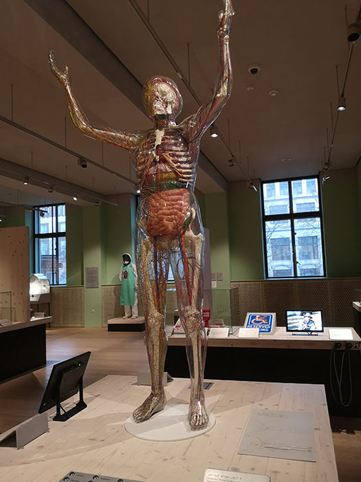
I went to the welcome’s collection “ being human” exhibition. The artefact "transparent body" made me question what a “normal” body looks like.
It made me think of my own, and how body dysmorphia is a big problem within society. Because it was a wicked problem, I focused on gym-goers, giving me the opportunity to find an actionable solution.
It made me think of my own, and how body dysmorphia is a big problem within society. Because it was a wicked problem, I focused on gym-goers, giving me the opportunity to find an actionable solution.
2. Research and Familiarisation
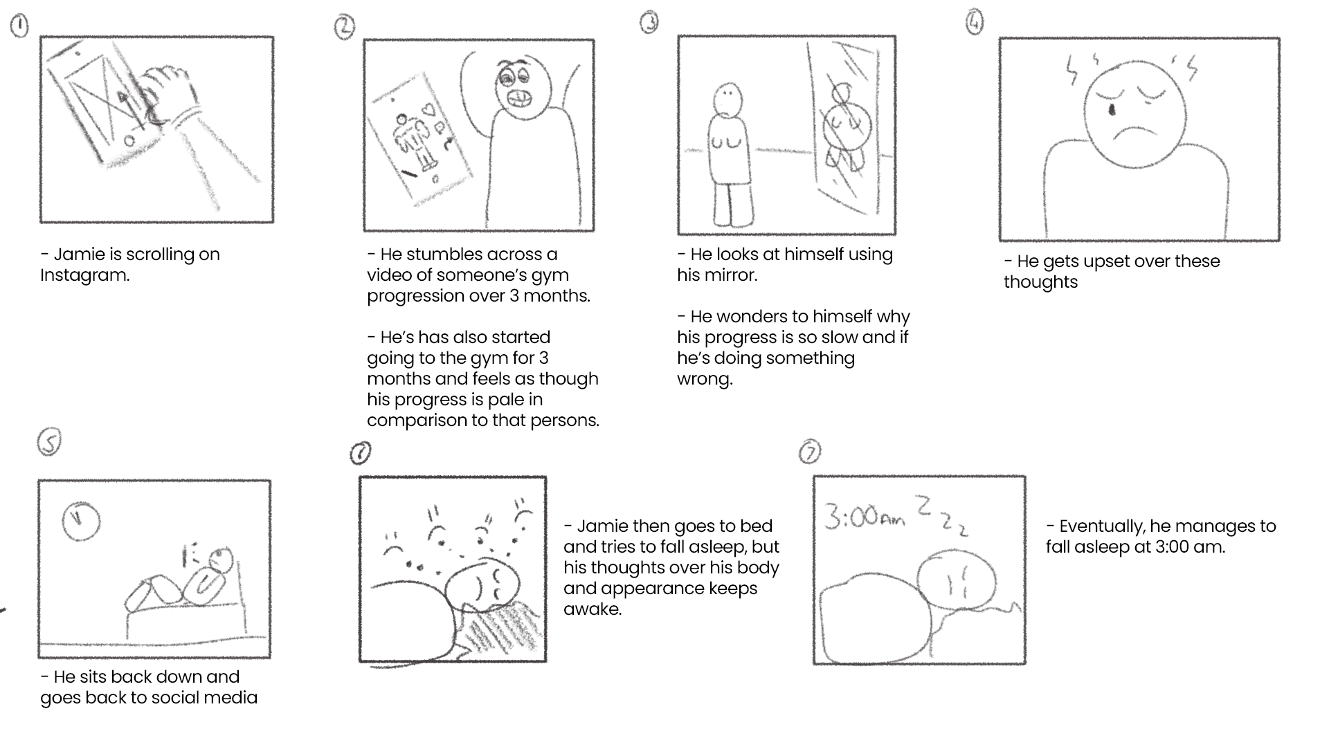
To familiarise myself with the issue, I created the persona and storyboard of Jamie, a teenager who starts going to the gym but quickly falls victim to external comparison.
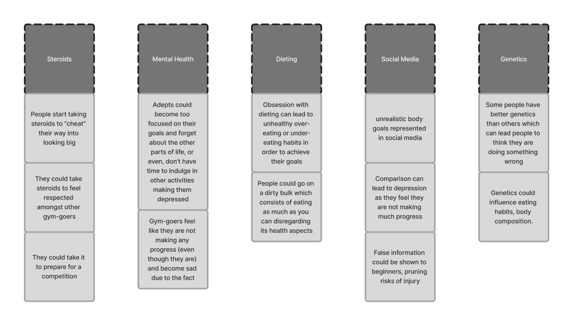
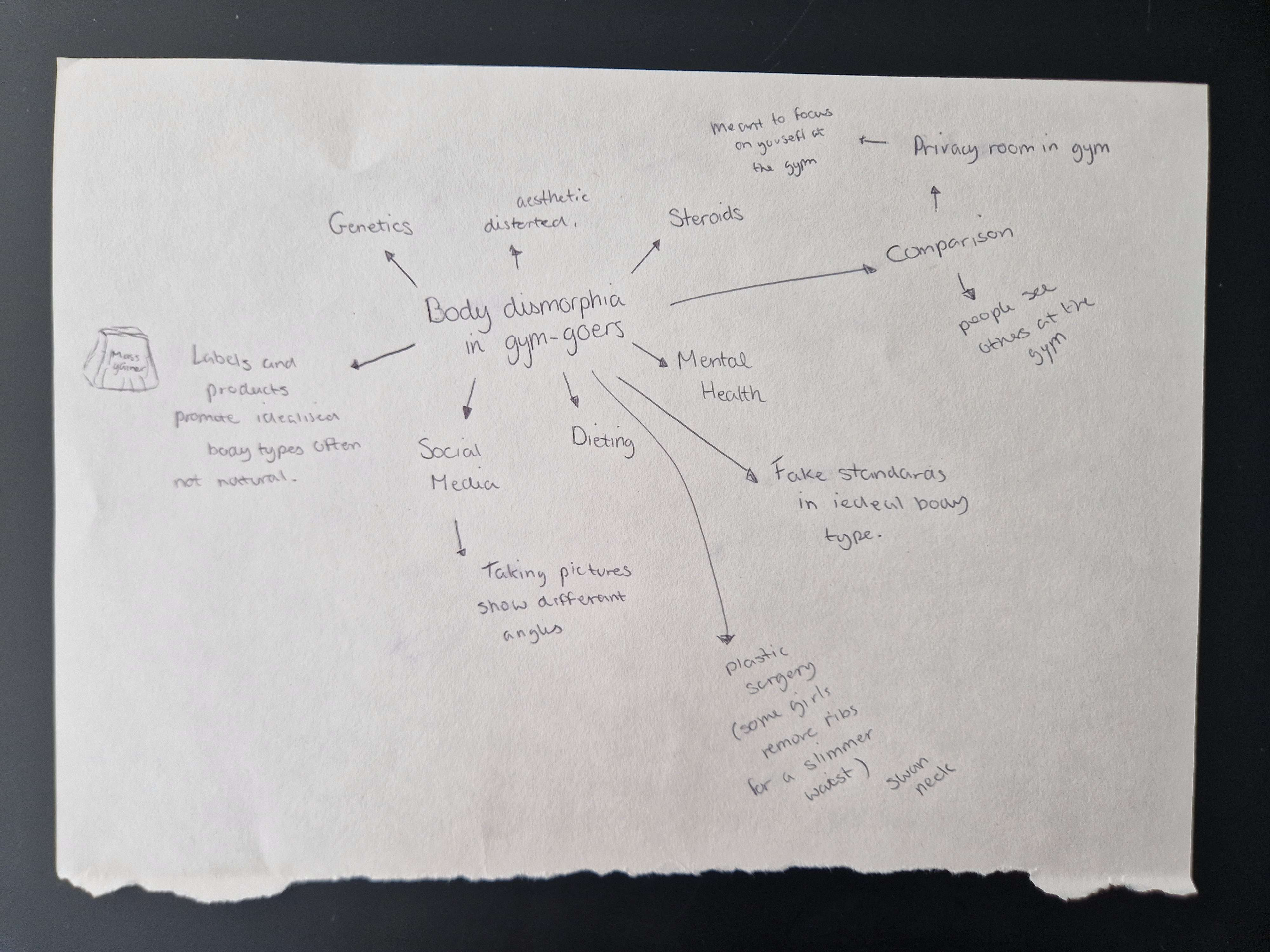
To deepen my understanding on body dysmorphia and its impact on mental health, I created user insights and a mind map to identify the core problems driving the issue.
3. Conceptualisation and ideation
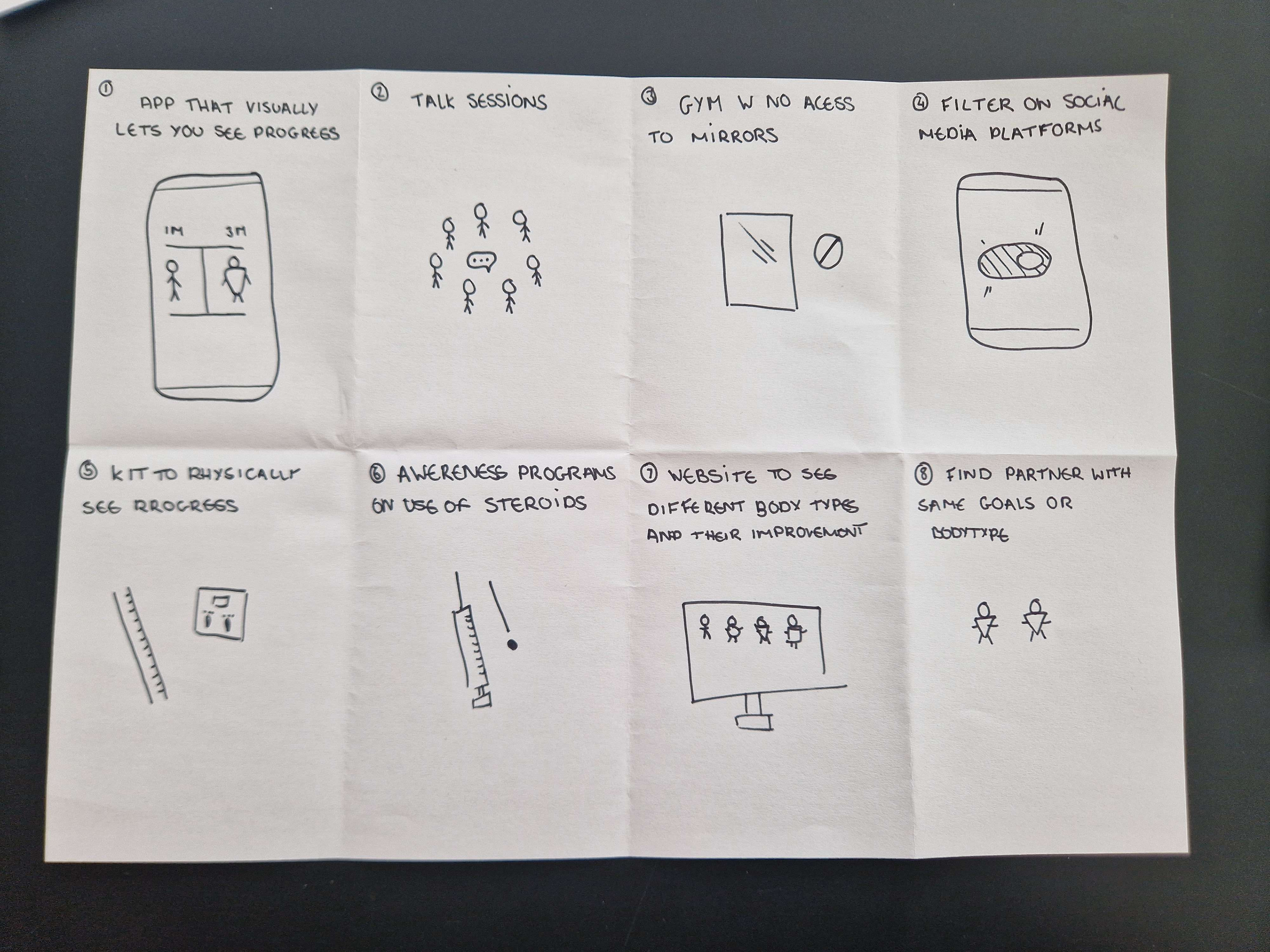
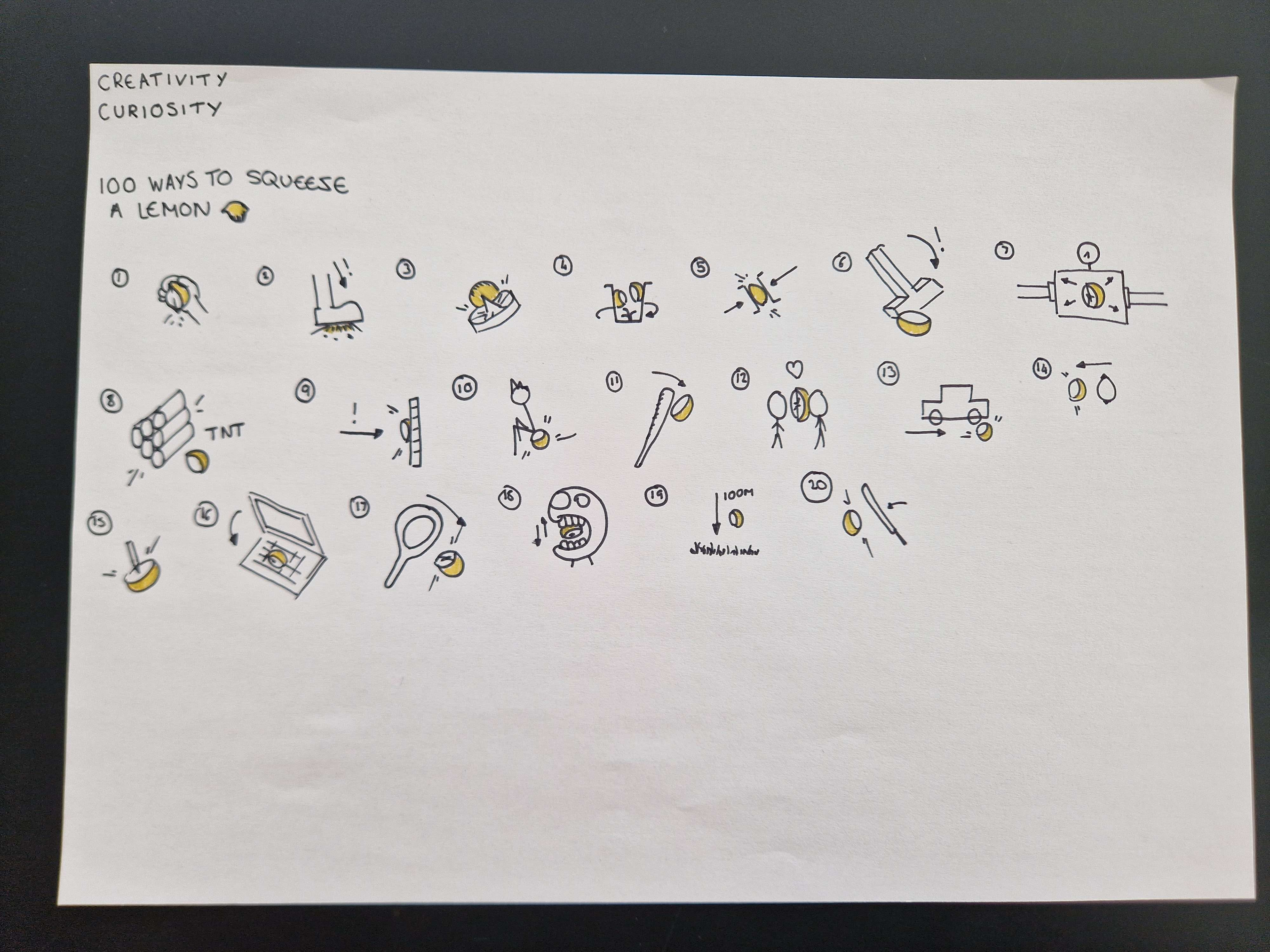
Exercise like "8 ideas in 8 minutes" and "100 ways to squeeze a lemon" allowed me to identify potential solutions that I could design. I liked the idea of using comparison as a tool for success by allowing the user to compare themselves instead of others. This change of mindset would positively affect their mental health.
5. Wireframing & Information Architecture
The core theme for this application was that it needed to be simple - I have seen and experienced myself too many gym progress apps that needed "take care of" to get real results out of it. This was not what I envisioned.
The user simply had to upload a picture every day, month - whenever. The goal was for someone to see their progress over time, and that's it. It had to be a tool that enriches your progress, not replace it.
With that in mind I began to ideate and refine my initial sketches, I initially thought of a signup feature but it proved too complex for the nature of the app. I wanted something trustworthy, reliable and easy to use.
Based on colour theory findings I used blue as it installed trust, something that's needed with people having this condition. A simple IA was also designed for users to understand effectively. I then picked all the sketches that were necessary, focusing on user centric wireframes that people are already used to.
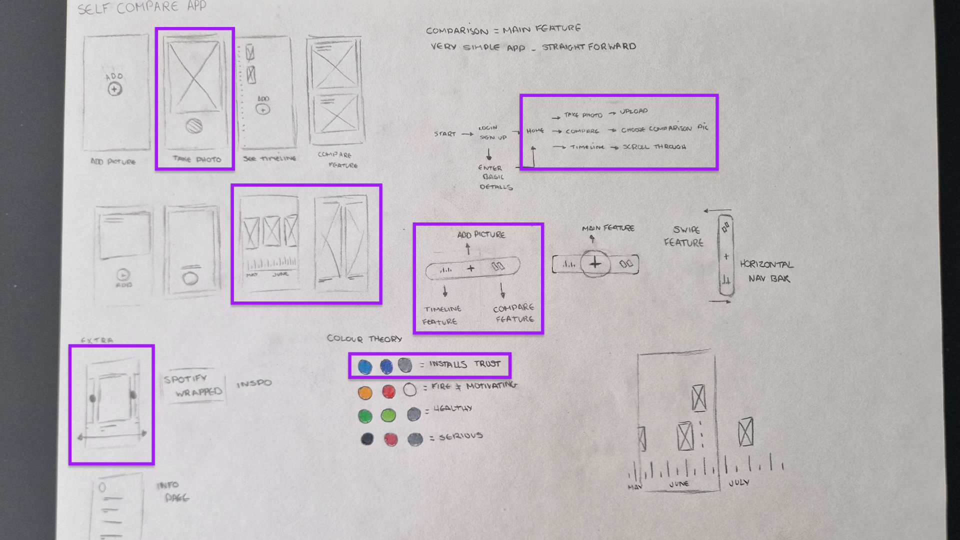
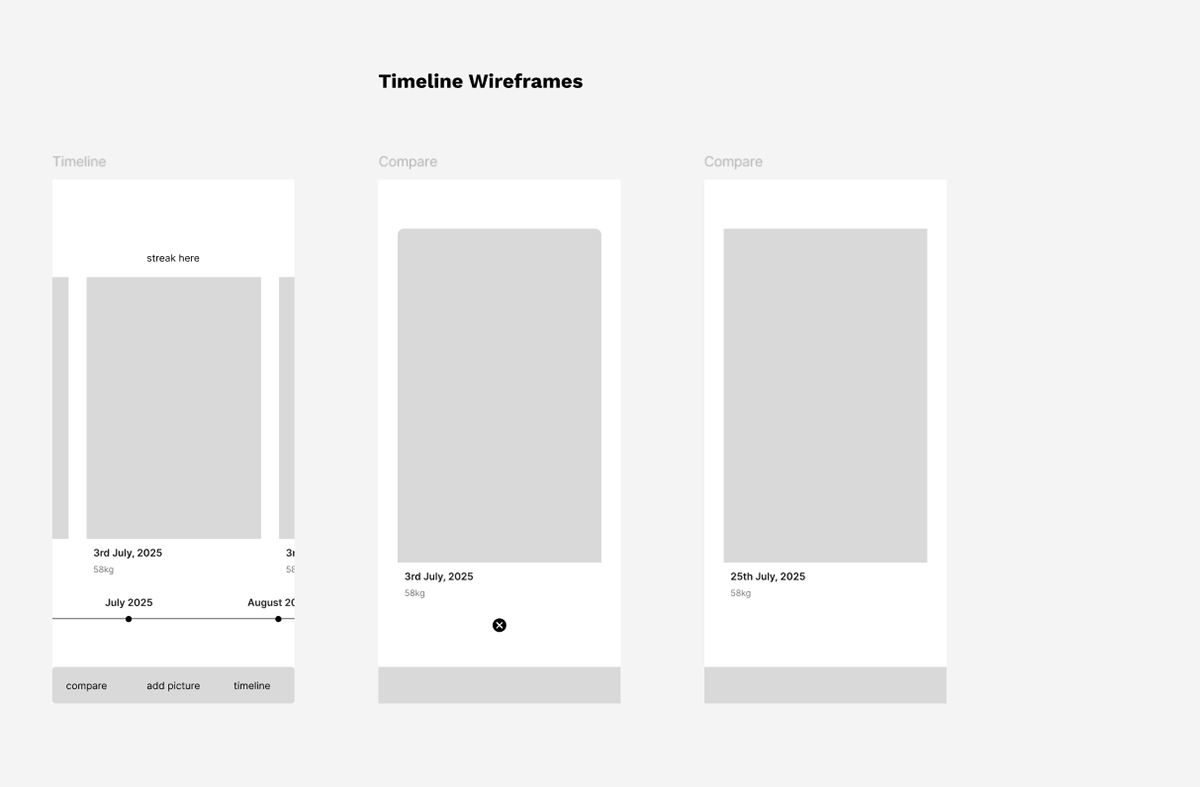
Lo - fi wireframes
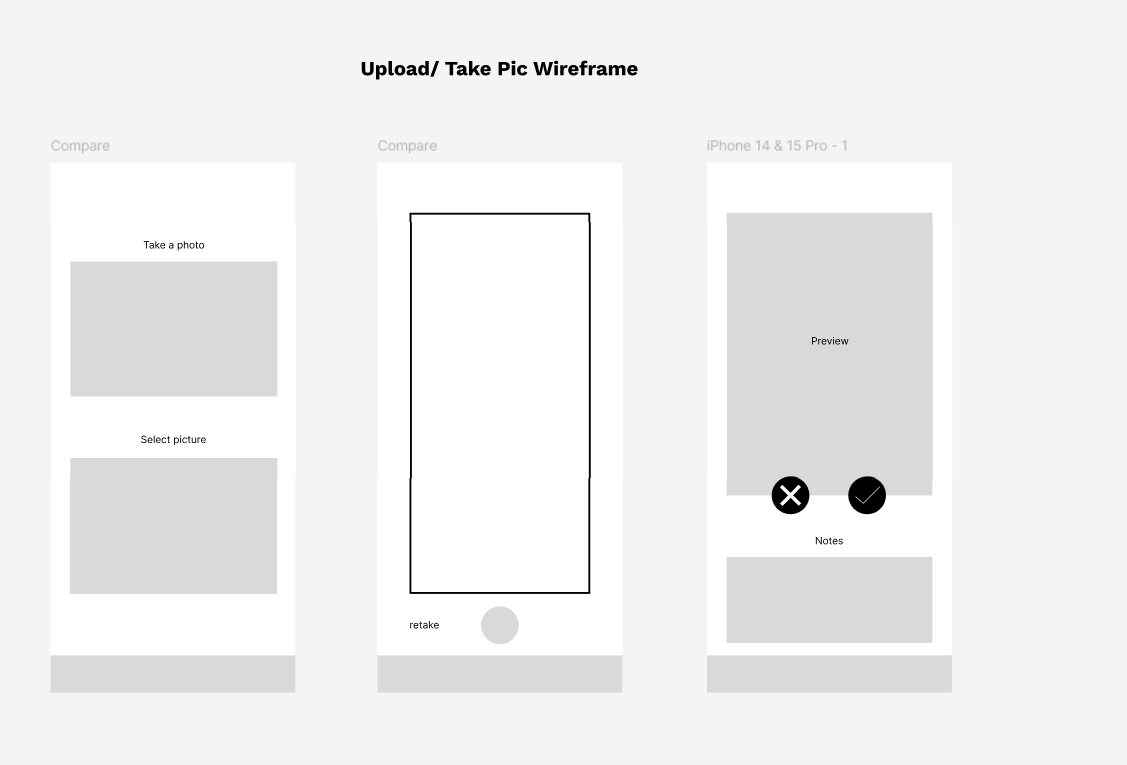
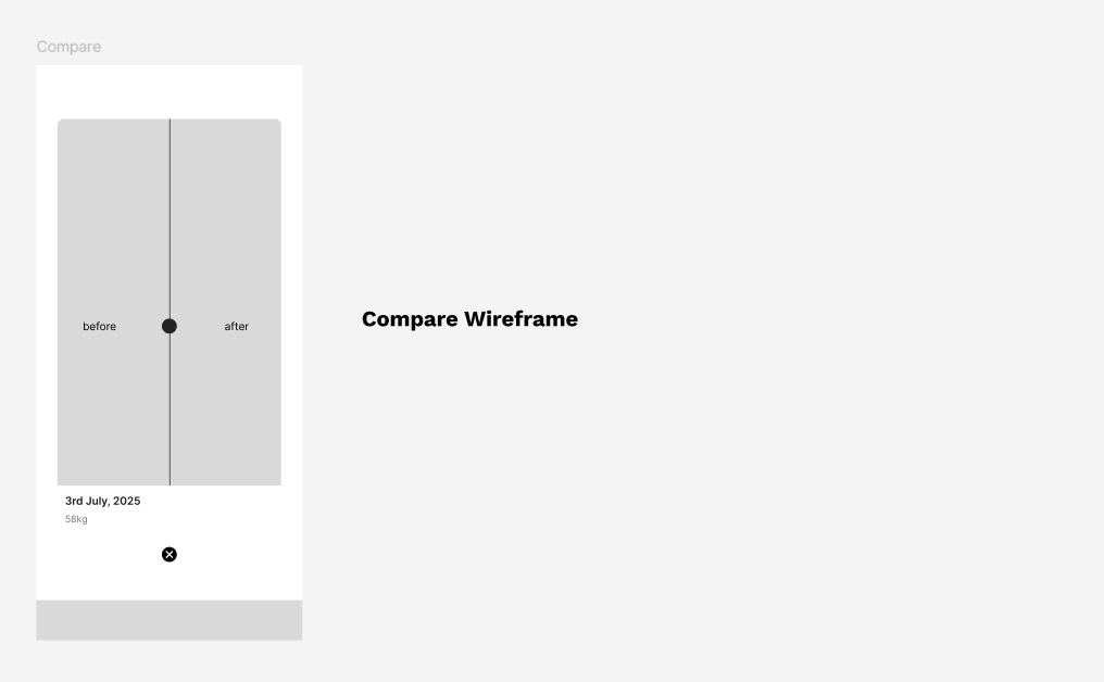
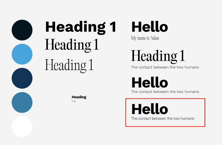
6. High-Fidelity Wireframes
This was the fun part for me, I took time to put the details in and made sure accessibility and usability were at the core of my designs.
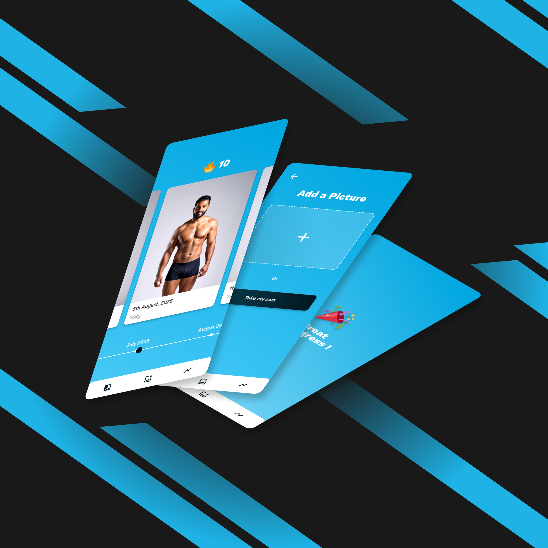
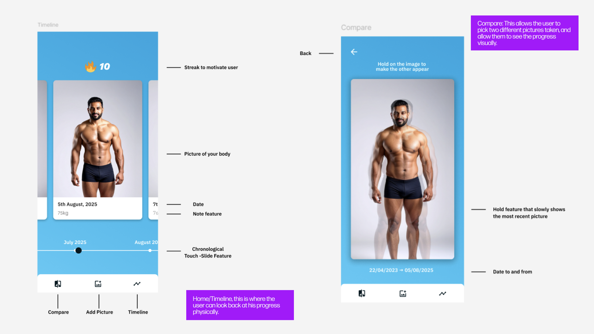
One critical iteration was to switch from the swipe feature to compare feature to a press and hold one. This would allow the newer picture to overlay over the older one. This meant that the user would be able to see their progress in one gesture - making it simpler. I also used an AI photo to avoid ethical concerns around consent.
Feel free to click on the images to view it in more detail!
Timeline and compare feature
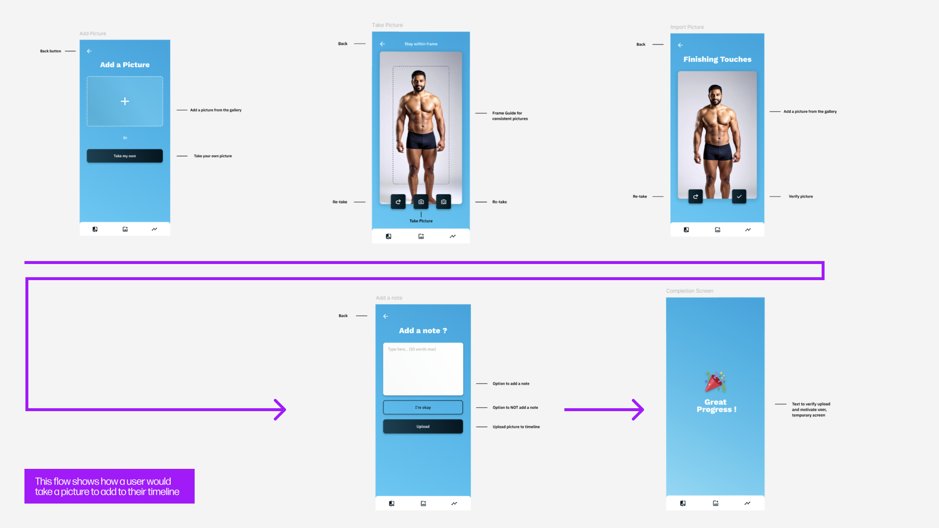
Add a photo - user flow
8. Reflection & Future Steps
Overall I loved working on this project, it was interesting to see a sculpture, ask myself questions and create a design form it.
There are questions as to what a user would do when they don't see any physical progress after using it for a while. My answer is that this app doesn't make progress for you, but instead lets you visualise it. Training is difficult, as someone whose been going to the gym for a couple years, there's definitely ups and down.
In future steps, I would conduct more user research, like usability tests and culture probes to further improve the usability. Unfortunately, as this was a university project, we didn't quite touch on that yet. But it would be interesting to see what it would look like based on the data collected.