
Omegle mobile app concept
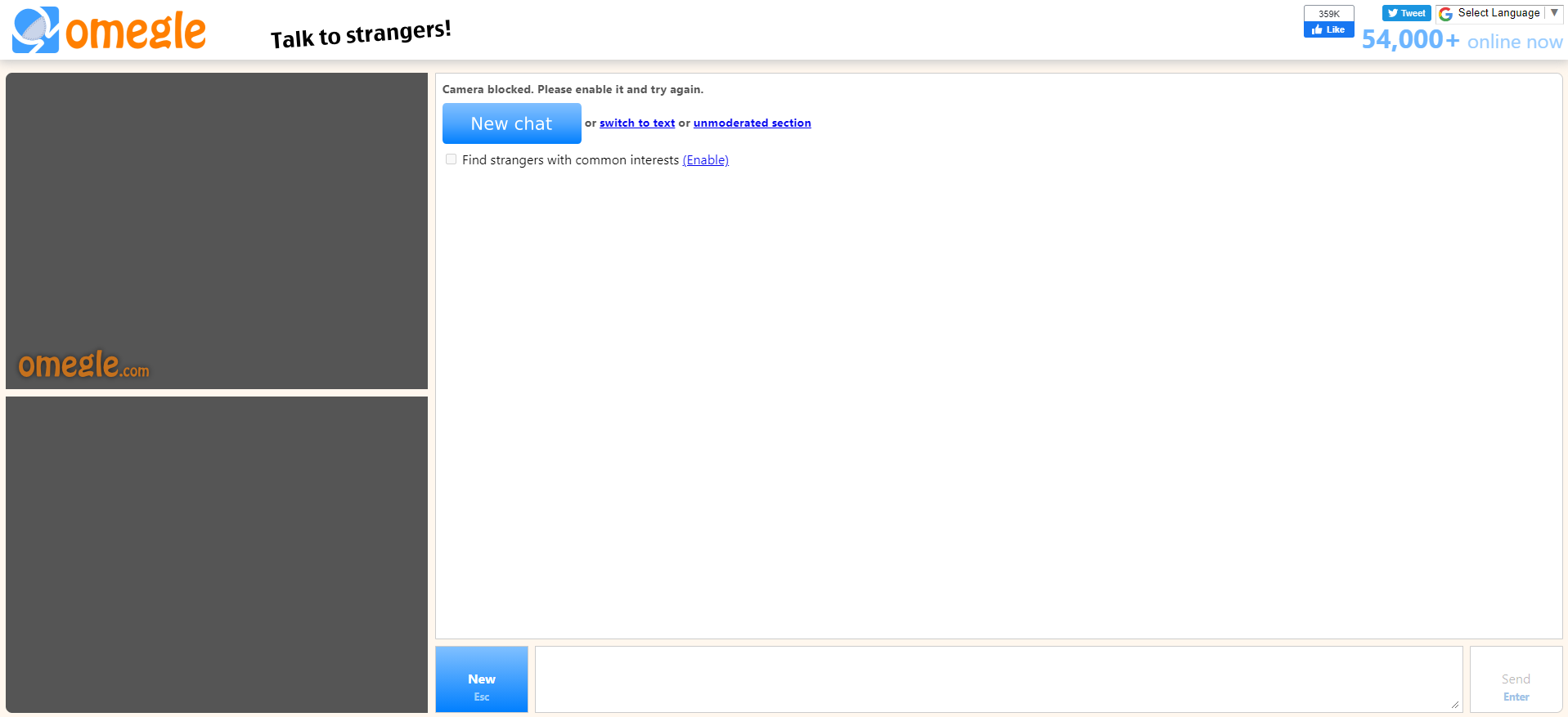
Omegle is a platform which allows users all over the world to connect virtually. It has shut down due to safeguarding issues as teens became victims of grooming. To counter this, I reimagined the platform into an app that provides a secure, 18+ approach while modernising the UI/UX using their brand identity.
1. Defining the Problem
The project addresses two critical failures that led to the original platform's shutdown:
Safeguarding issues: This is the main reason why it shut down, there was no security, allowing underage users to access the platform
Old UX/UI: The early 2000s desktop UI was outdated and not optimized for mobile.
2. Adapting and Securing the user experience for mobile
My solution involved two core user flows:
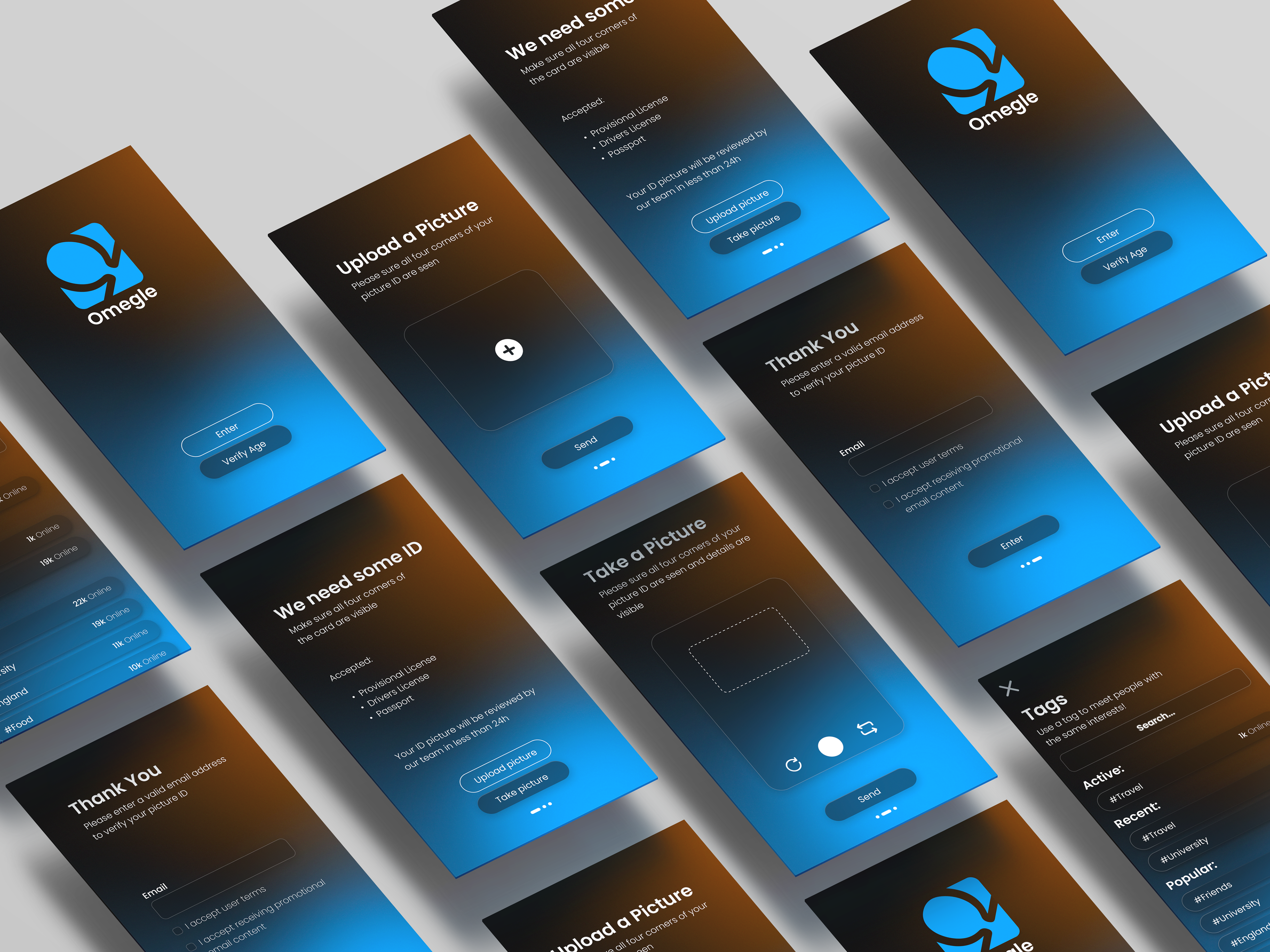
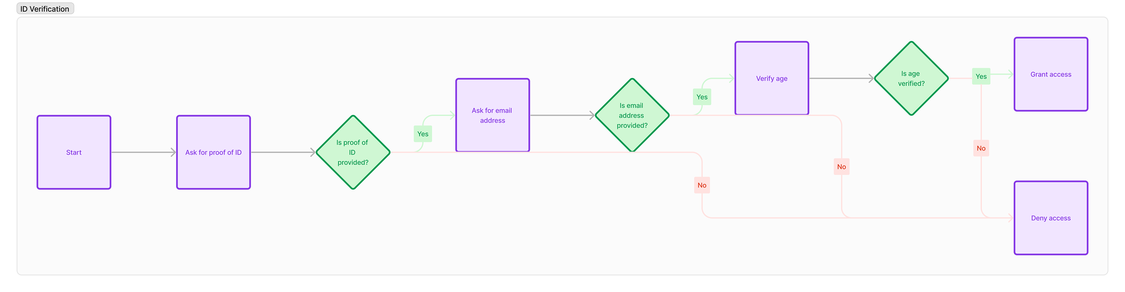
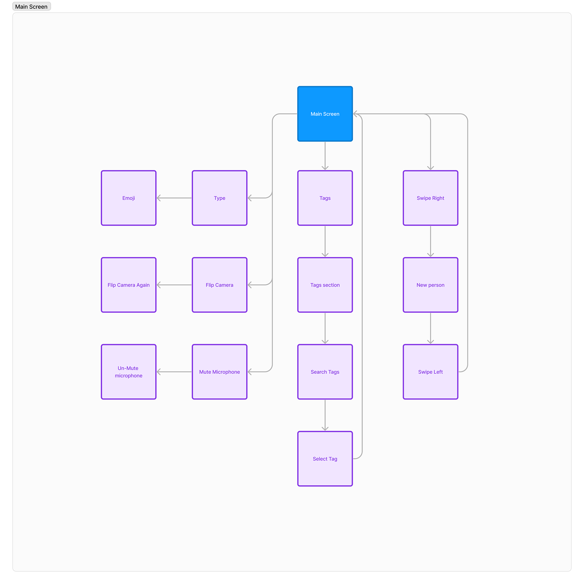
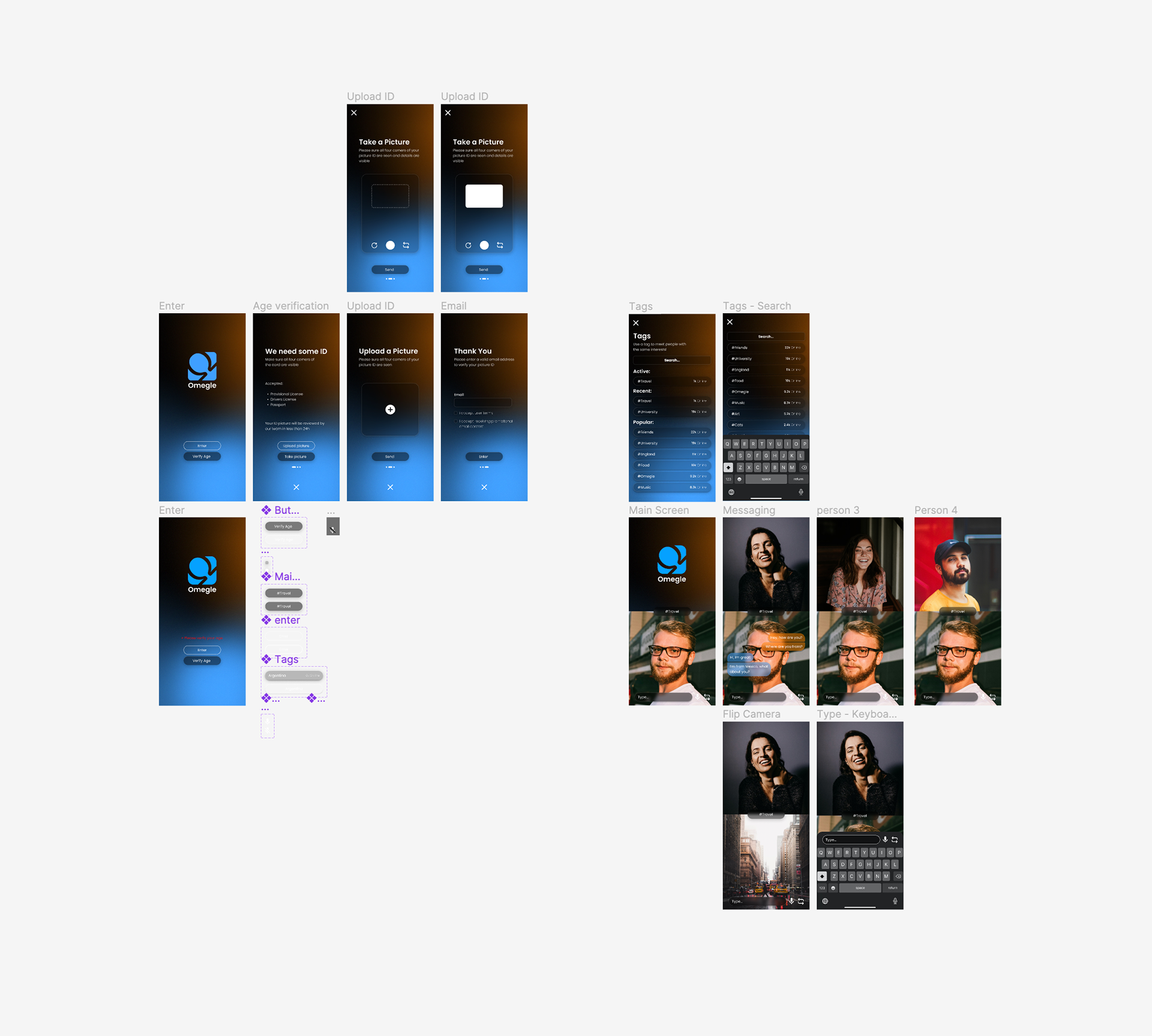
ID verification: I designed an easy to use user flow to make sure every user was of age, this was done using Fig Jam and peer assessed by my teachers.
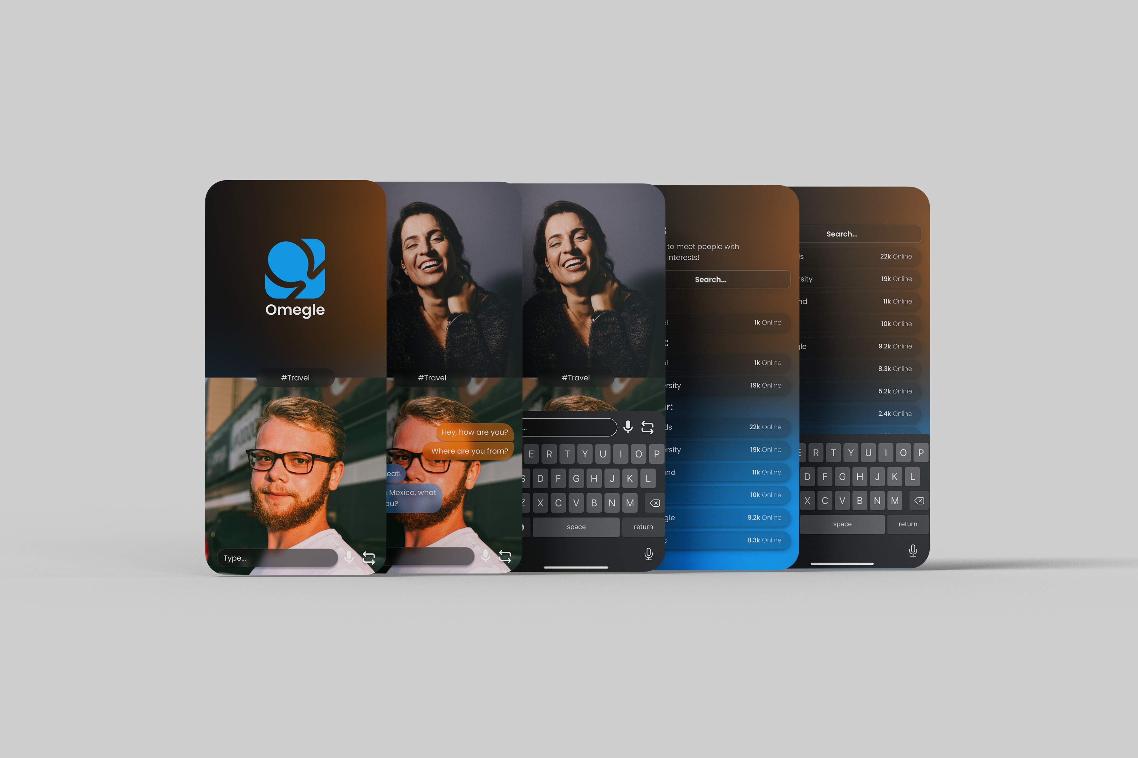
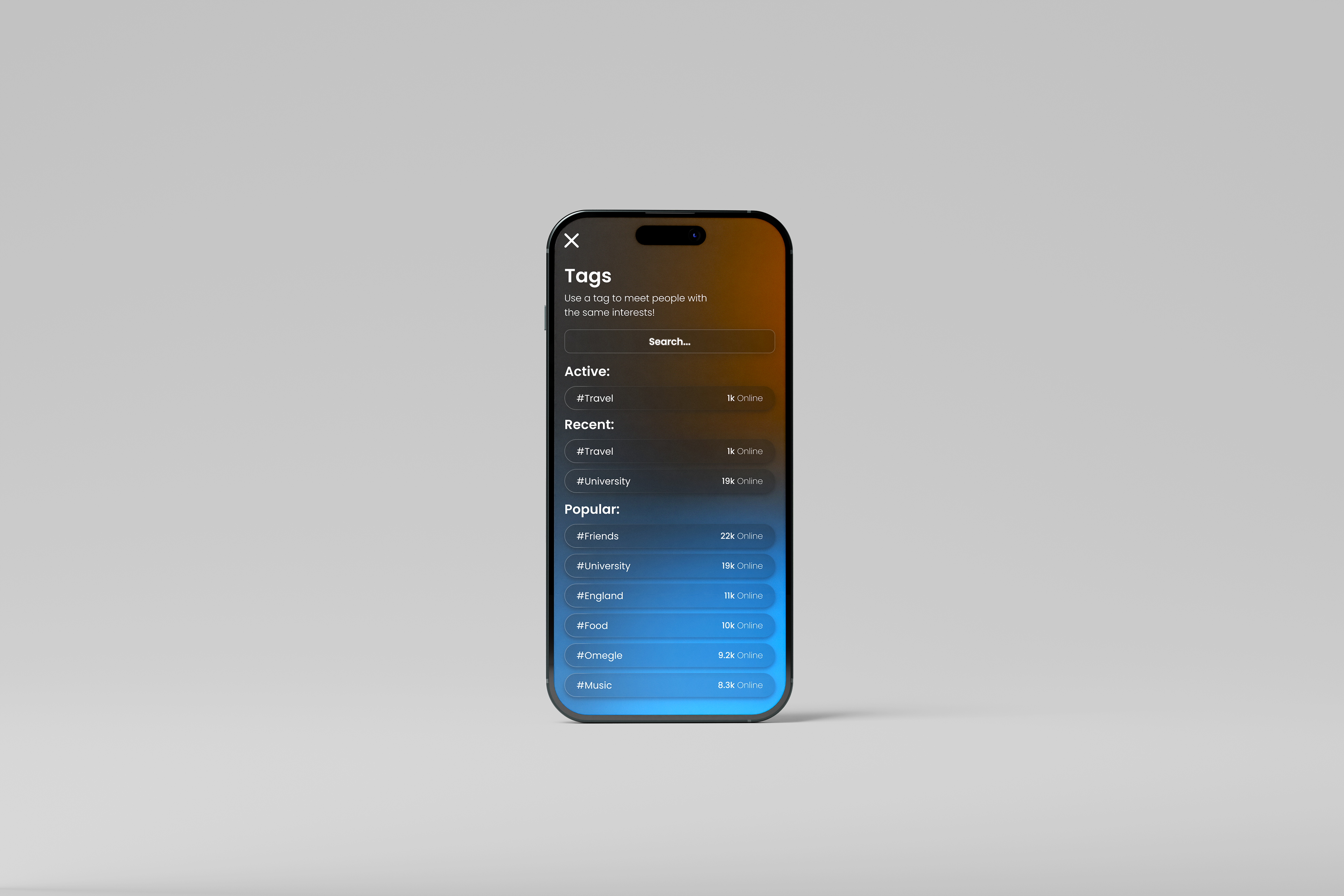
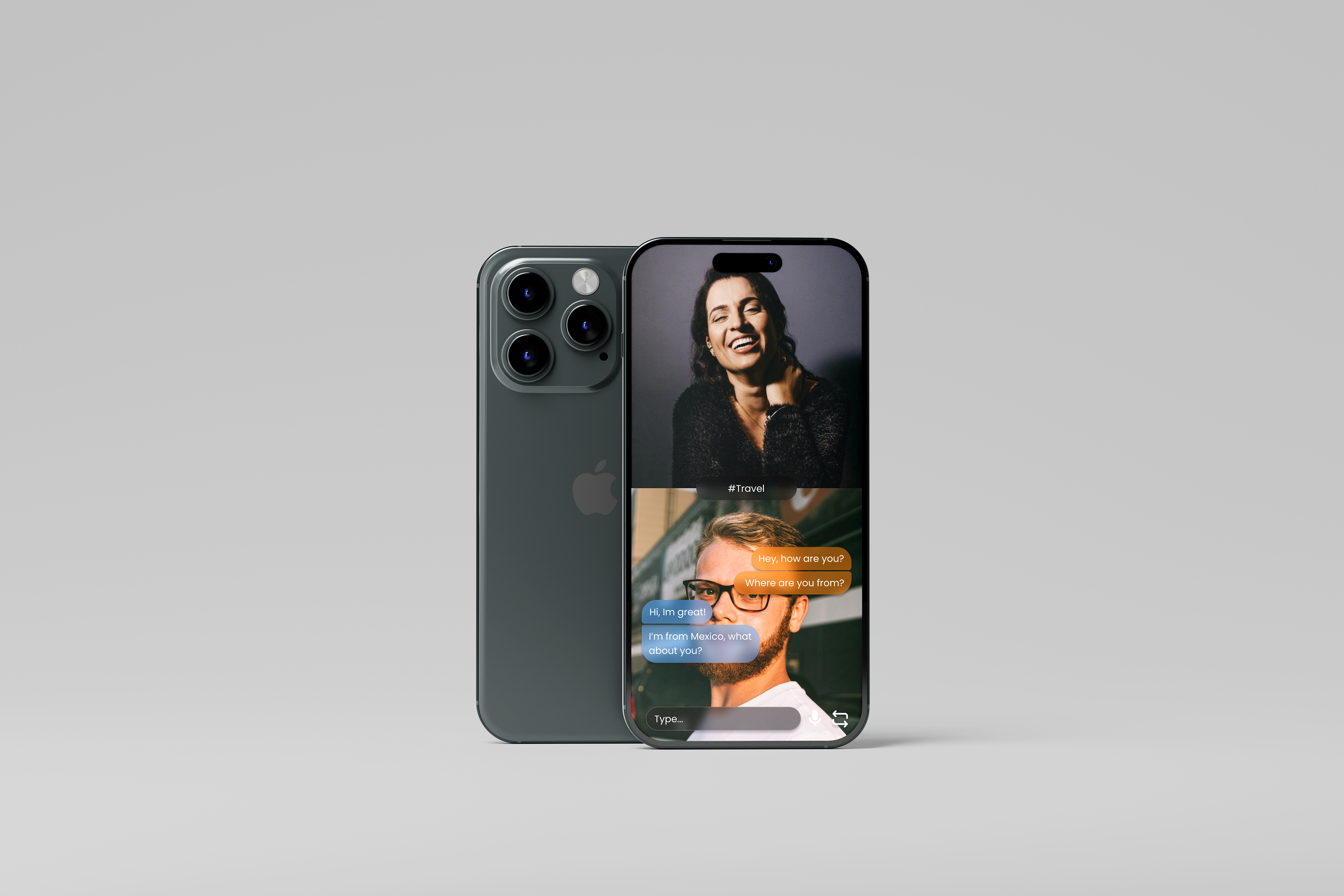
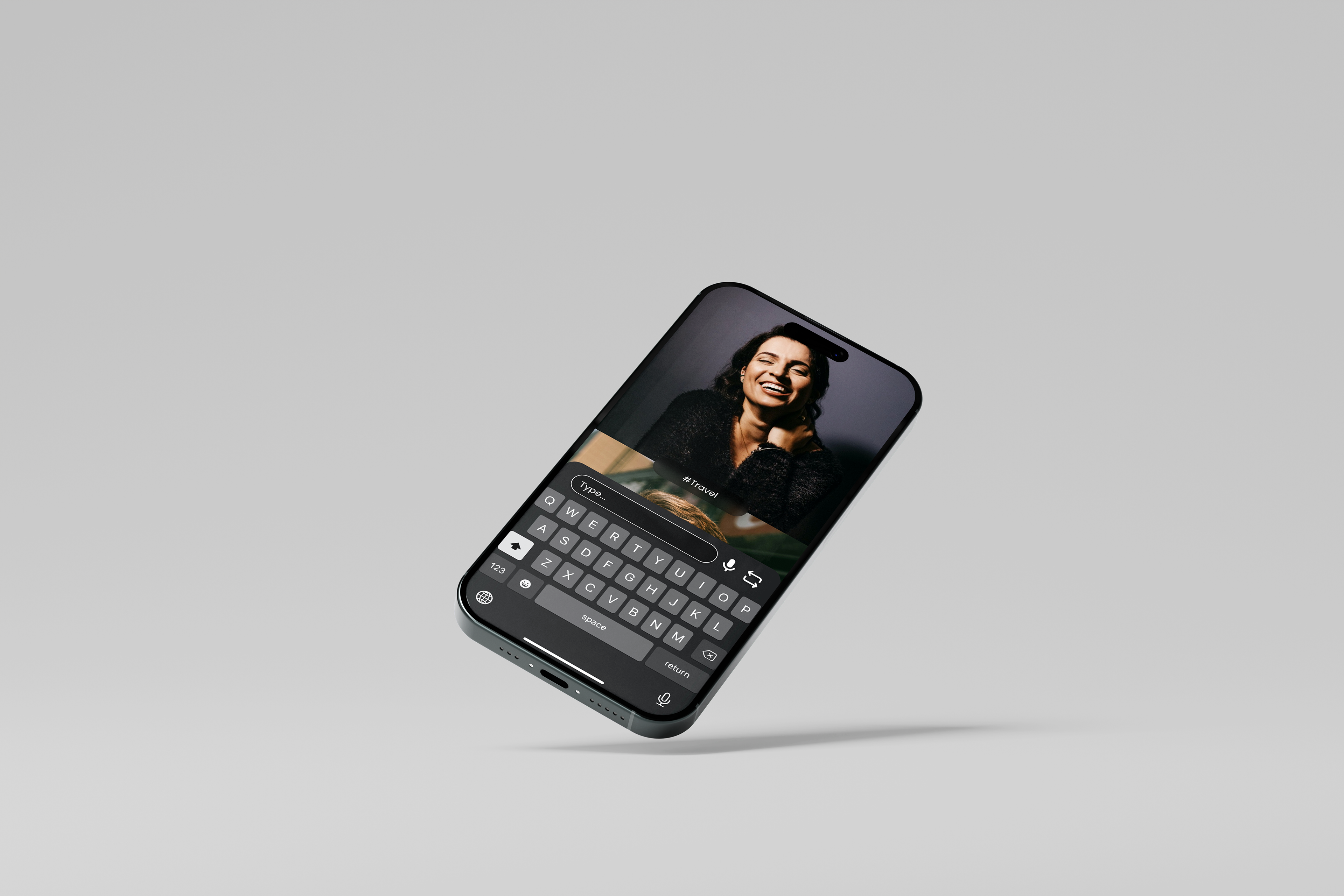
The app as a whole: I imagined myself as a user, what would be the easiest way for me to navigate the app? Using Omegle's existing experience, I reimagined it through the lens of a mobile user. I kept all the native features like the search/tags, new person, etc.. and adapted them for a mobile friendly experience.
User Flow - ID Verification
User Flow - The app itself
2. Ideation and Iteration
Here I start the journey of interface design while keeping Omegle's theme. I used their iconic colours (blue and orange) and modernised it by introducing a soft mesh gradient. The app had to feel trustworthy and user centric, this was done by thorough testing and iteration with feedback from classmates and teachers
V1 - Initial Wireframes - I play around with colours, font sizes and layouts until validated by my peers. This was crucial to the development of the design.
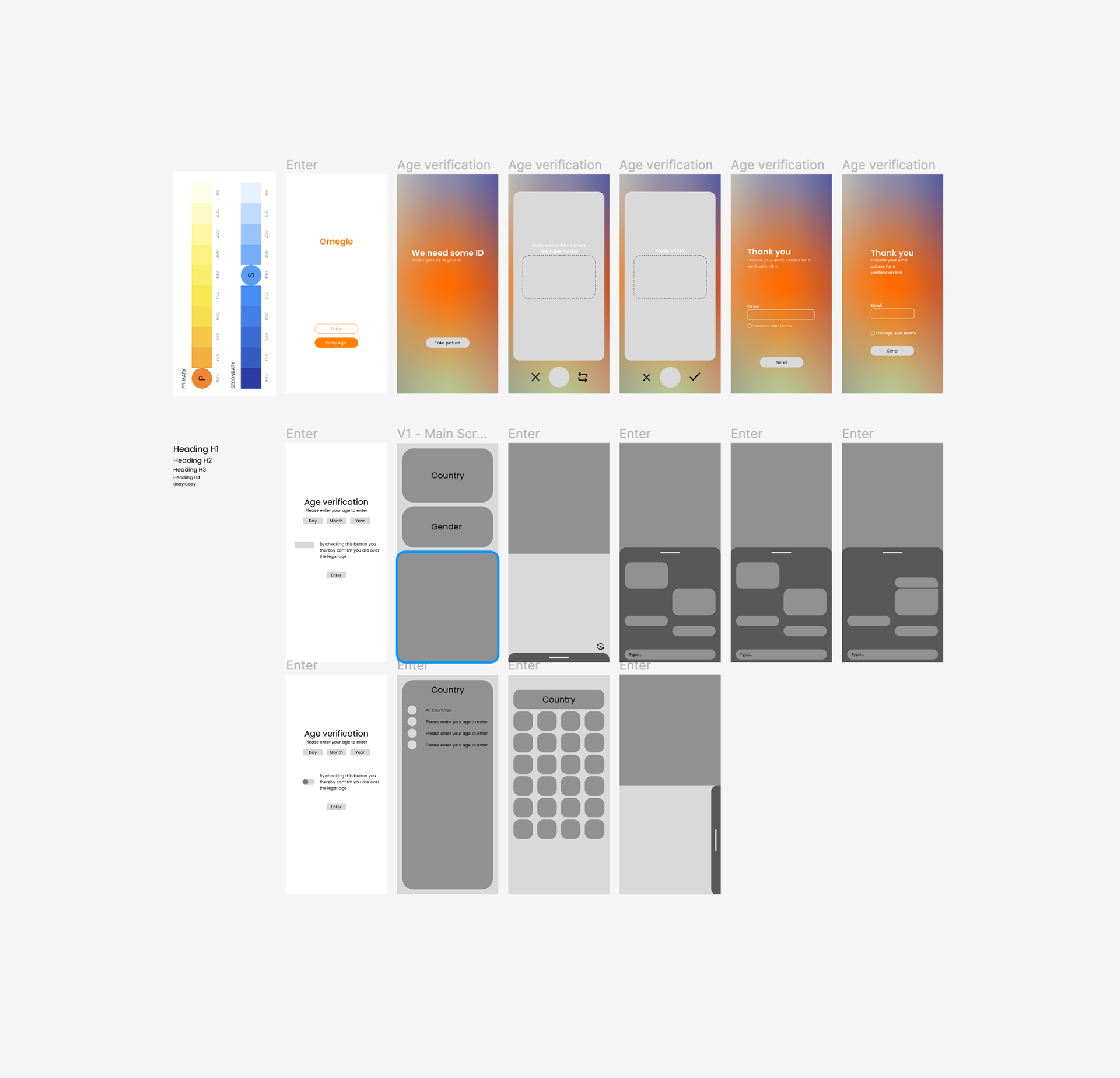
V2 - Wireframes to Hi-Fi development - I selected previous wireframes and further developed them until I had a visual system that was coherent.
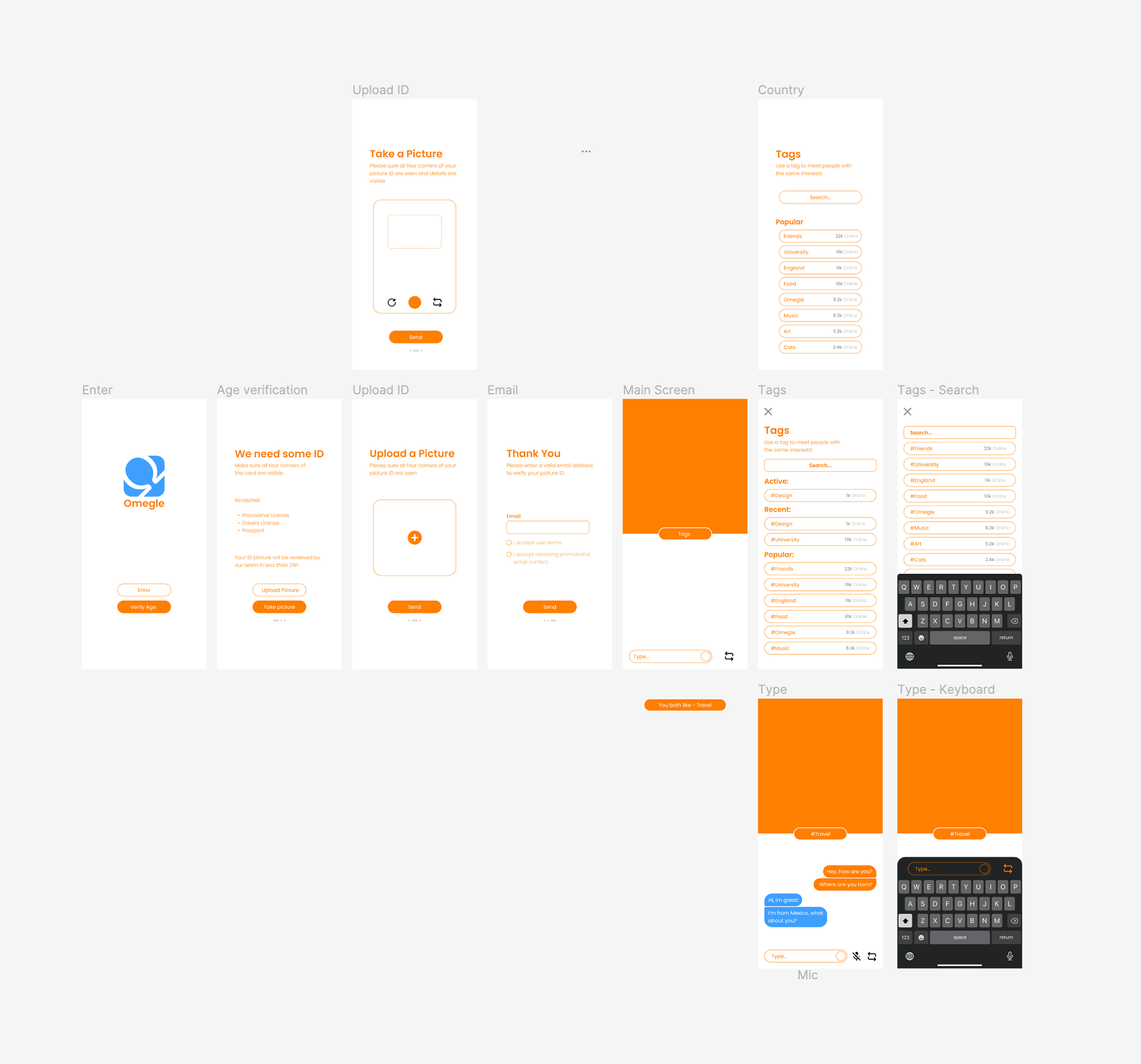
V3 - Hi-Fi Screens - Feedback from my peers stated the app was too orange and felt there was no hierarchy. Using the colour blue, I highlighted important components of my design, making it more user centric and visually appealing.
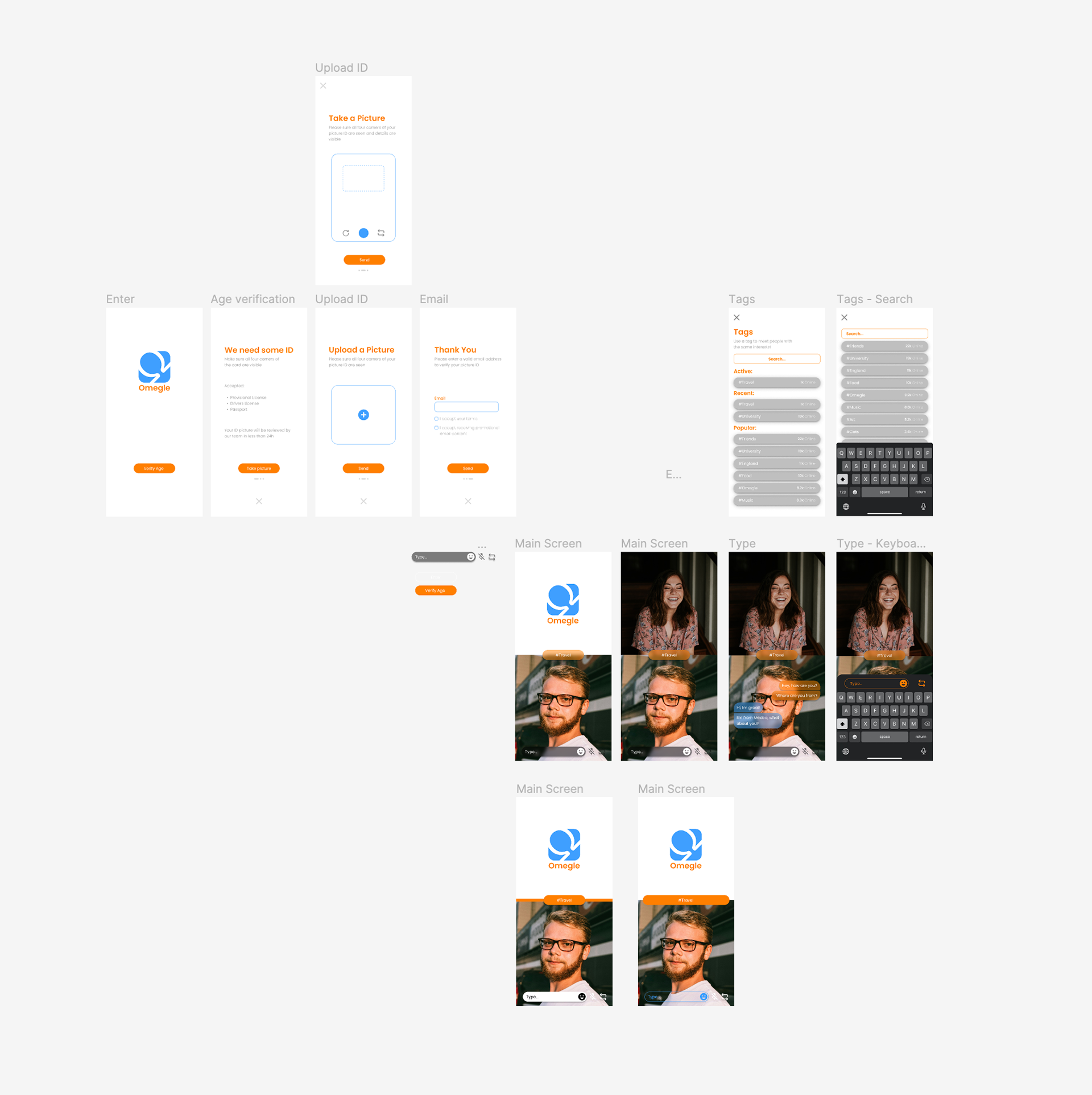
Final Version - I switched over to a darker version of the mesh gradient seen in V1 as I loved how it looked, but it also made the app feel clearer. I also added small details like drop shadows to further improve the design.
4. Reflection & Future Vision
This project successfully solved the projects major flaws, I introduced a working ID verification system - removing underage audiences from accessing the platform. I also re-designed the UX/UI making it look and feel modern, sleek and professional.
Moving forward it would be great to create the website, allowing for more users to enter the platform. More user research could also be conducted to fine-tune the app, improving user centricity.